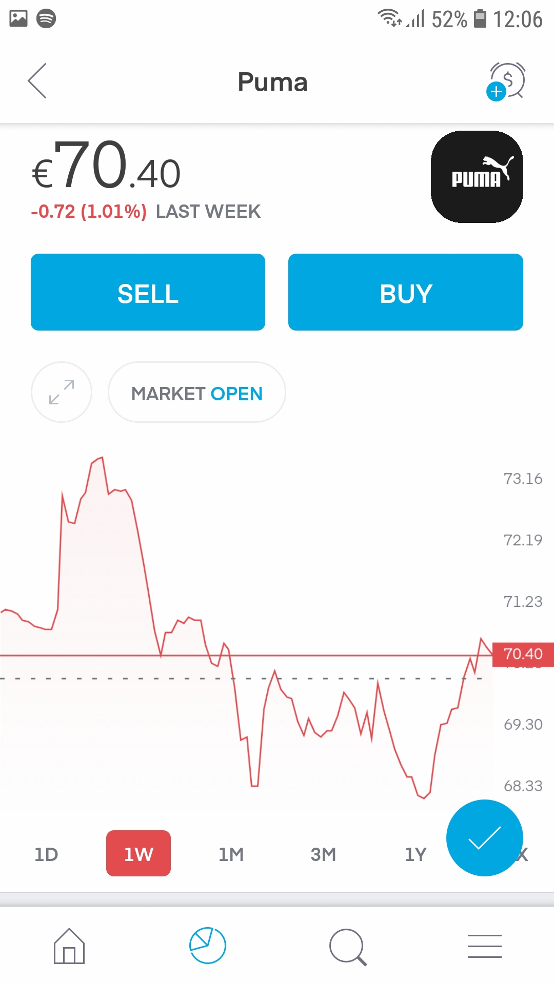
I am often lost in time when looking at the charts in the mobile app, asking myself questions like:
How did the stock perform yesterday again? > looking at 1W view >
 Where does yesterday begin/end?
Solution idea:
Have thin vertical lines to separate the graph.
For 1d view it represents start of an hour, for 1w view the start of a trading session etc.: