Chart improvements / make them user-friendly

Hello,

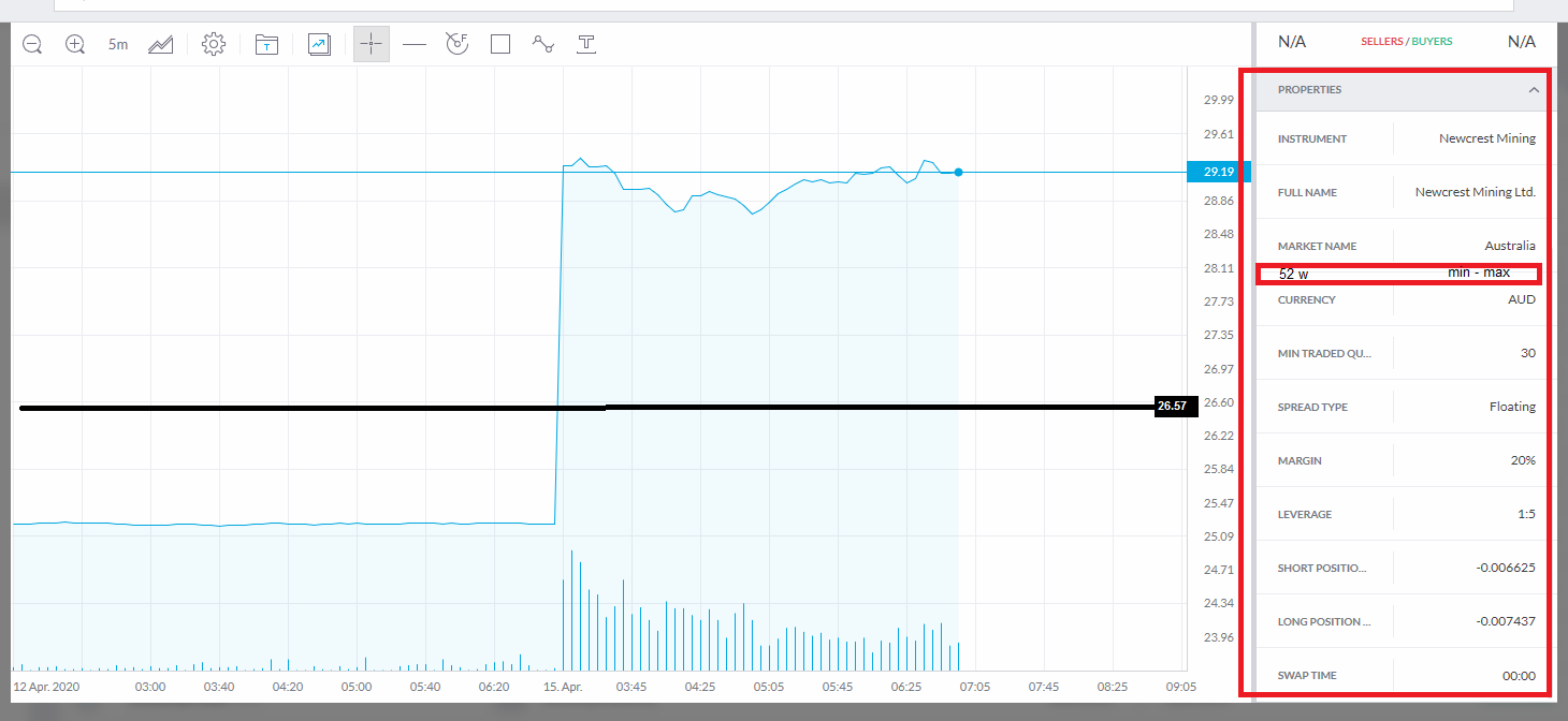
I find really complicated and not user friendly at all the zoom/detail level of the chart and its usage …

Can you replace or make it work “normal” like in any other scroll or zoom level available app which uses charts? :slight_smile:

Thank you!

Later Edit: please see new reply with other idea

1 Like

Also why is there a limit to how far back a chart goes? What if I want to see it’s all time high/low?

probably because there is no other data available or that is when it got listed to the stock market?

But anyway, hopefully a tech/developer will see these :smiley:

Additionally

  1. is there a way to add a new property field containing the previous 52w trading statistics ?
    (like the min and max share value within the previous 52 weeks interval)

  2. can you add an average on the graph per the displayed area?

An example of the above:


*the “average line” in my picture might not be mathematically correct, as when making an average of the area of the displayed graph, but I just put it as an example value

Thank you.

1 Like