Another ridiculous massive step back in UI design.
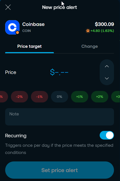
Who really thinks it a good idea to go from a clean, easy to use everything presented at once with quick simple one click percentage options to a nothing, bare, have to type everything in manually screen?
Just terrible…Do you actually use your own platform, this is a joke, add it to the list of massive blunders your UI team have concocted lately.
For the sake of all your users just revert back the UI design you had in the first few months of the year where everything was clean, information and values was readily available, the UI was friendly to use…
Just WTF. Trading212, please fix.
Count actions if I’ve to modify alert note:
1 scroll,
2 click “see all”,
3 click alert
4 click modify note
5 click save changes
6 click again save changes.
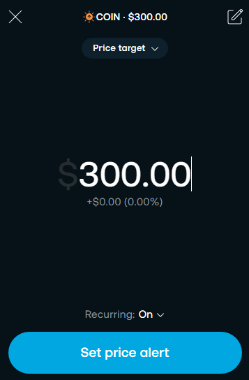
And, I can’t see price amount ant price alert note in one page. Alert note box hides alert price. Also, double dialog box makes so darkened background, that’s impossible to see candle movement etc.
And what about create new alert with % price change in 1 hour with alert note and changing recurring status? Insane amount of clicks and modals I have to walk through.
Who thought, that giving only one action per screen is a good idea? If you’re creating app for the watch - maybe it’s good.
Just noticed, that if my alert note text is longer, I can’t see as a whole. It just displays one line by line. View one line - click next line, previous line disapears!
It’s like reading a book which has printed one letter in one page.
Oh dear Lord, please return the price alerts to the way they were, this is terrible
I love some of the other changes made recently and that the team are always looking to make improvements But please change this one back
Totally agree.
How about that recurring alert toggle switch behind the drop down list, I mean, they must have an investment in mouse button switches because the only thing this does is unnecessary extra click for no reason, never in any other software or platform on the planet have I seen a single option behind a drop down list, horrendous design.
I’ve messaged on here, I’ve started a chat with them and asked this exactly. I’m really struggling with the previous layout. I feel like it’s gone backwards.