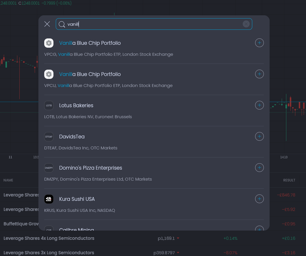
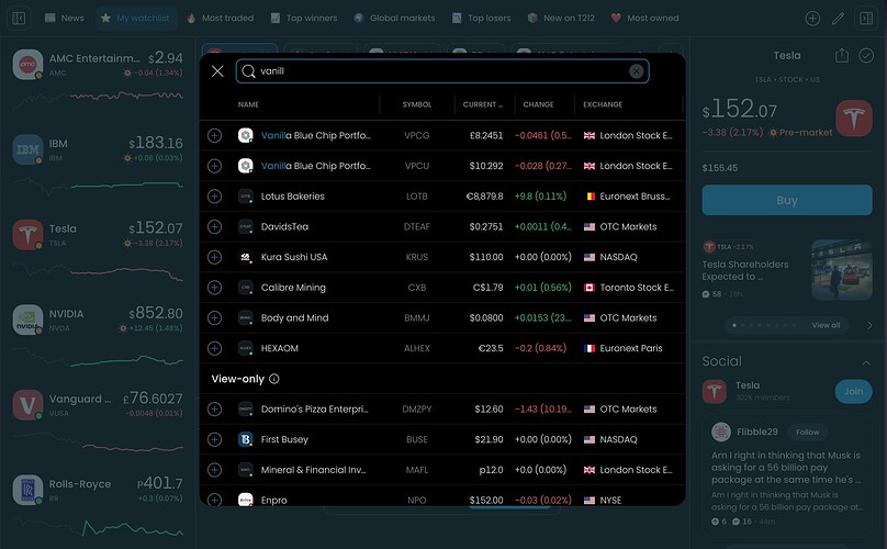
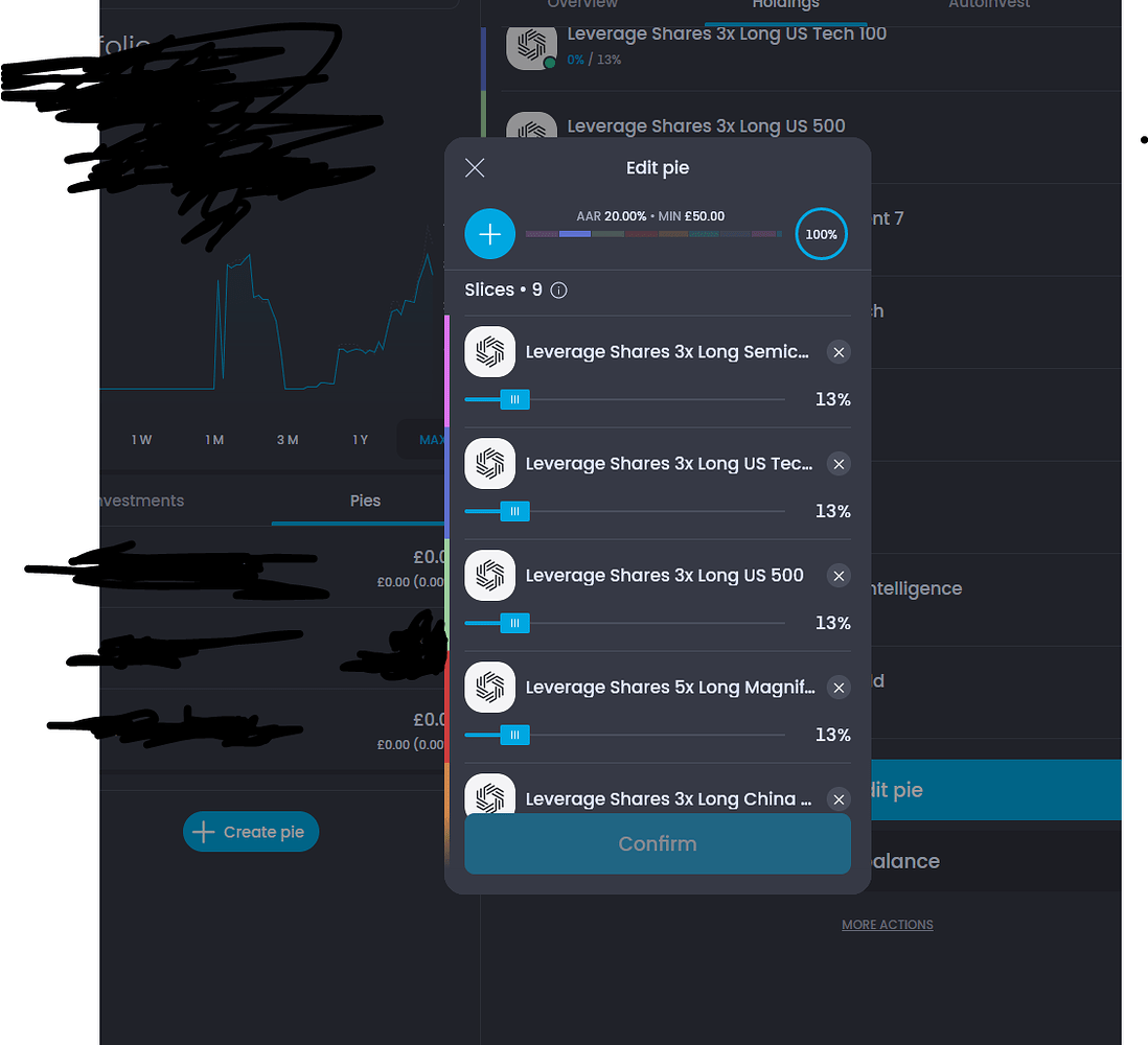
Can we not combine these two buttons + two popups?

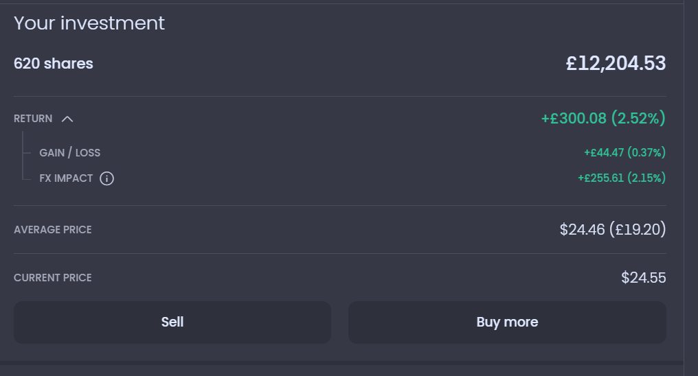
I’d remove sell and buy buttons here:
Alerts are now taking up too much space. I guess you did this in case the descriptions are long? I think 2 per row worked better.
Also I’d order them by price. So if current price is $10, my alerts should be in this order $7.50, $8.30, $11.50, $15

I personally never use the -3% -2% etc buttons, pretty confident most people don’t either. I’d remove these too.
All this stuff:
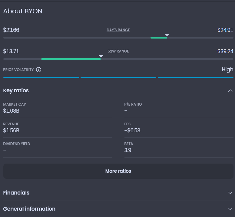
I would have a button at the top of the right-side column. Maybe and (i) icon above the price chart or in the header section of the stock.
And I would put the “Instrument Details” section there too.
So for people that want more info, want to see rations etc, it’s right at the top, you click on it and then you get all that info just as it’s laid out now, except it takes a mouse click to get to it. I think it makes it more accessible and it decluters the page too.
I would even bring History as an icon at the top too.

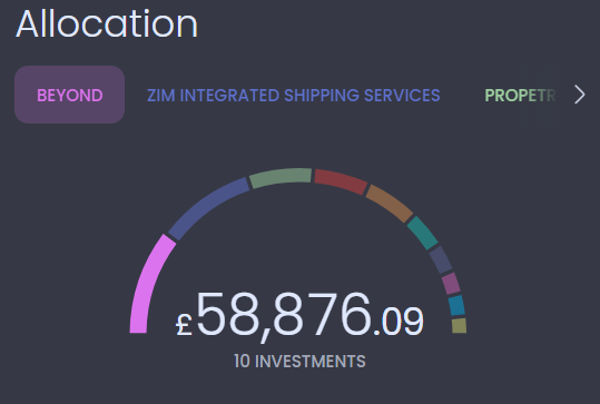
I would replace this:
with this:
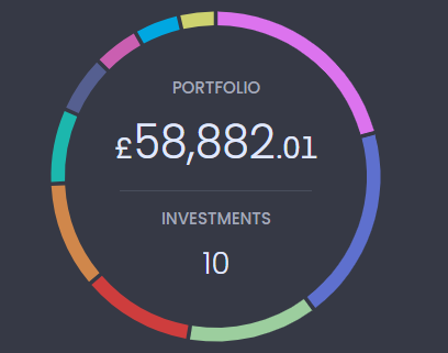
As it’s currently not very user frieldly + takes too many user interactions to get to the data.

And I would make the companies much more visible, maybe as “bubbles” one after the other.
I love this on the advanced view home page:

I especially love that you can reorder and add remove columns.
Great add!
Sorry but I would reorder the top part:
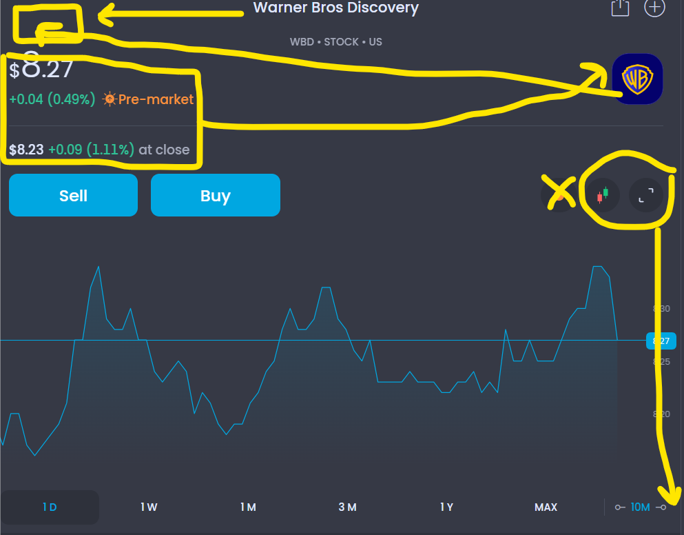
Left top:
Logo, Company name, Ticker, Type, Country.
Sell / Buy buttons
Top right: Price
Price change (Percentage change) Market Status
After hours price + percentage change
Followed by Chart
Underneath Price range (D/W/M/3M/etc.), Chart Period, Candle/Line chart (I would remove this but you could keep), then Full Screen button.
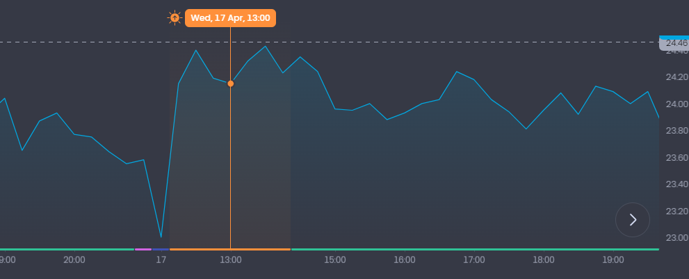
I also really like the different coloured sections of the price for individual companies to show which price movement has happened during market hours, after market, before market open, very very good, I love this!
I would reduce the border around comapny logos in the left-hand side list:
So it looks like this:

This is much, much cleaner!
